Properties ( )
)
This panel provides access to all available properties of a selected diagram object. You can fine-tune a shape or a connection using the simple settings.
Basic settings ( )
)

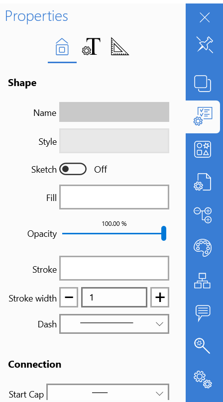
Name
Sets diagram object name.
Style
This property will help you set style for the current object. Click it to get access to the list of pre-designed styles of the Default theme. Select from this list. The style will be applied to the selected object only. If you would like to style the complete diagram, you can proceed to the Themes Gallery and select one of themes from the list. The style will apply to all diagram elements at once. If you need to style an individual object in the selected theme, get back to the theme styles and select the one you like best.
You can also edit themes to make them more suitable for your purposes. Click “Edit theme” to go to the theme editor and make changes to the theme styles. You can change fill, stroke, opacity, text font, size and color, etc. It’s possible to add new styles and delete the existing ones. You can load custom themes from your PC or OneDrive. Click Back to return to the Object properties panel.
Sketch
This is a unique option that makes the shapes look as if they were drawn by hand. It’s a very convenient way to indicate diagram parts that are not finalized yet and need more attention when you are designing a diagram. Just enable it to make diagram objects look like sketch.
Fill
Sets fill of the selected object. You can choose from the list of basic colors or gradient fills. If none of the colors in the list suits you, you can use fill picker to make your selection more accurate. You can specify fill type: Solid, Gradient or Transparent. Selecting Gradient fill enables additional setup options: Start and End color and fill angle. Selecting Transparent fill hides all options and makes the shape transparent. Click Back to return to the Object properties panel.
Opacity
This property sets opacity of the selected diagram element. You just need to move the slider on the left to make it completely transparent. Move the slider to the right to make the object dense.
Stroke
Stroke sets color of the shape contour. Click on it to proceed to the list of basic colors. Select from this list or you can fine-tune color in the Fill picker. You can also select stroke type: Solid, Gradient or Transparent. Selecting Gradient fill enables additional setup options: Start and End color and fill angle. Selecting Transparent fill hides all options and makes the shape transparent. Click Back to return to the Object properties panel.
Stroke width
This option sets width of the shape contour. Click “+” to make it thicker, and click “–“ to make it thinner. The default value is 1.
Dash
Sets line type of the shape contour. You can select from the line, dashes, points and various combinations.
If the selected object is a connection, the following properties become active:
Start cap
Sets start cap of the selected connection. You need to select from the dropdown list.
End cap
Sets end cap of the selected connection. You need to select from the dropdown list.
Route
Sets route pattern for the selected connection. You need to select from the dropdown list.
Object’s Text properties

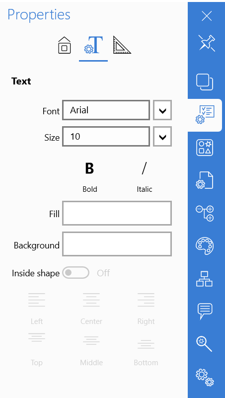
Click the Text icon ( ) to proceed to the text options panel.
Font
Sets font type for the selected shape. You need to select from the dropdown list.
Size
Sets text size. Set it manually in the textbox of select from the dropdown list.
You can make the text Bold or Italic with a single click on the corresponding icons.
Fill
Sets fill of the text. You can choose from the list of basic colors or gradient fills. If none of the colors in the list suits you, you can use fill picker to make your selection more accurate. You can specify fill type: Solid, Gradient or Transparent. Selecting Gradient fill enables additional setup options: Start and End color and fill angle. Selecting Transparent fill hides all options and makes the text transparent. Click Back to return to the Object properties panel.
Background
Sets background color of the text. You can choose from the list of basic colors or gradient fills. If none of the colors in the list suits you, you can use fill picker to make your selection more accurate. You can specify fill type: Solid, Gradient or Transparent. Selecting Gradient fill enables additional setup options: Start and End color and fill angle. Selecting Transparent fill hides all options and makes the background transparent. Click Back to return to the Object properties panel.
Inside shape
This property sets if the text will be located inside or outside of the selected shape. Just toggle the switch to set the necessary location of the text. If you select “Outside of shape” option, the text will be located outside the shape and the additional control point will appear next to it. This control point will help you select a more precise location of the text. Just drag it to move the label. If you select “Inside shape” option, you can also setup text location within the shape. Use the buttons below the switch to setup the desired position of the label inside the shape.
State properties( )
)

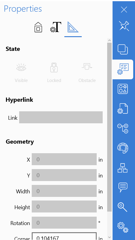
Visible
Using this property, you will be able to manage visibility of the diagram object. Just select a shape or a connection and click the icon to make the selected element invisible.
Locked
The use of this property allows locking of the selected diagram element to prevent it from any changes, accidental or intentional. If the option is enabled, the control points become grayed out to indicate that you won’t have access to the following object properties and won’t be able to change them: location and size. The other object properties such as color, style, fill, stroke, etc. can be changed on the corresponding panel. The available manipulations are Copy, Duplicate, Delete and Create connection. To unlock the locked object, you will need to go to the Object tree panel (since you can’t select it with mouse or by tapping on it because it is locked), and disable the Locked property by clicking the corresponding icon next to the required diagram object.
Locking objects is useful if you want to place an object behind others and don’t want to accidentally move it while clicking on the objects in front of it.
Obstacle
The property sets if the selected diagram object is an obstacle for connectors. If it’s enabled, all the connectors will route around the selected diagram element. If the option is disabled, connectors will route on top of such an object.
Hyperlink
You can add hyperlinks to your diagrams. Just select a shape and set http address of a page you would like to go to. A little call out will appear next to the shape. Clicking on it will forward you to the web browser where the set web page will open. To remove the hyperlink just click the cross button.
Geometry properties
The following properties allow users to set diagram elements position, orientation and size in a more precise manner than if it was done visually, by hand or mouse.
X
Sets position of the selected diagram object on the X-axis.
Y
Sets position of the selected diagram object on the Y-axis.
Width
Sets width of the selected diagram object.
Height
Sets height of the selected diagram object.
Rotation
Sets rotation angle of the selected diagram object.
Corner
This property sets rounding of the corners. It is applied to rectangles, chevron diagram elements and connections (when the latest has several route turnings).
Thickness
Sets thickness of the diagram element. Can be applied to wall elements in floor plans.