Website Wireframe
What is a Website Wireframe

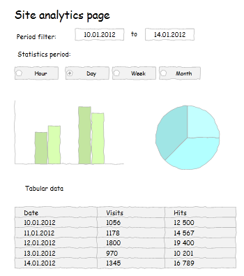
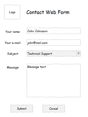
Website wireframe (or website mockup) is a schematic representation of future web pages. It depicts layout of basic page elements: picture and video blocks, text content, navigational system, etc. and shows how all these elements interact with each other. Wireframes usually don't include colors, styles, and graphics as they mainly define page functionality, behavior and content type; it determines what the page can do but not the way it will look like.
Why use Wireframes
Wireframes make it possible to immediately estimate some web design aspects: module layout system, visual hierarchy, free space, symmetry, golden ratio, rule of thirds, etc. The mockup is used by all specialists engaged in the website design process:
- Marketing team use it to offer ideas, compose generic navigation paths, proof usability and estimate development time and cost;
- Developers use it to make sure that they include the necessary modules and navigation elements on each page and verify that the final layout addresses customer vision;
- Copywriters need to estimate the available space and type of content to be added to the page;
- Graphic designers should create the corresponding user interface throughout the site according to the wireframe.
So, development of a professional-looking website wireframe is very important as it is used on every stage of website design. Use of such sophisticated graphic editors as Photoshop is not reasonable in most cases, as wireframe developer (who usually doesn't get deep knowledge of Photoshop) needs just to depict website layout schematically. And using Photoshop or other similar sophisticated software for such non-artistic purposes is just a crime, as if you use Titanic to deliver a small package. Besides, it doesn't feature special tools such as pre-designed shapes that denote various website modules which could streamline website mockup development and let you focus on your idea of web page functionality.
How Grapholite can help
Grapholite is the perfect tool for creating comprehensive wireframes since it offers all necessary elements depicting website modules, it's intuitive since it has generic Office-styled user interface.
Grapholite offers:
- Library of pre-designed shapes to show the complete variety of website elements;
- Export to the most commonly used picture and document formats;
- Ability to share the wireframe which is very important as it combines information architecture and visual design and a lot of professionals are engaged in the process.

How to develop a Wireframe
Development of a wireframe includes three components: information design, navigation design, and interface design.
Information design
Information should reflect the goals and call visitors to some desirable action. That is why it should be displayed in the most efficient way to provide clear communication. A website visitor needs just 3 second to understand if he got to the right place and you have only these 3 second to convince him that he really arrived to the right resource. This is why you need to prioritize information in order to facilitate understanding. Use sub-titles, short lists to enumerate advantages of your products or services, be laconic, don't use sophisticated or rare words, sentences should short and simple.
Navigation design
Smooth navigation to the desired goal (registration on the website, subscription for news or services, download of product trial, purchase, etc.) is an essential part of any website. Your user should clearly see navigation options he has on every particular page. That is why navigation system needs to include eye-catching screen elements (buttons, navigation menus, hyperlinks inside text, etc.). Navigation design is extremely important for commercial websites and is quite challenging since the visitor should finally go to the checkout page and spend some money.
Interface design
User interface should be intuitive and simple and allow the user to easily interact with the system. Common interface elements include action buttons, text fields, check boxes, radio buttons and drop-down menus.